PROJECT
OVERVIEW
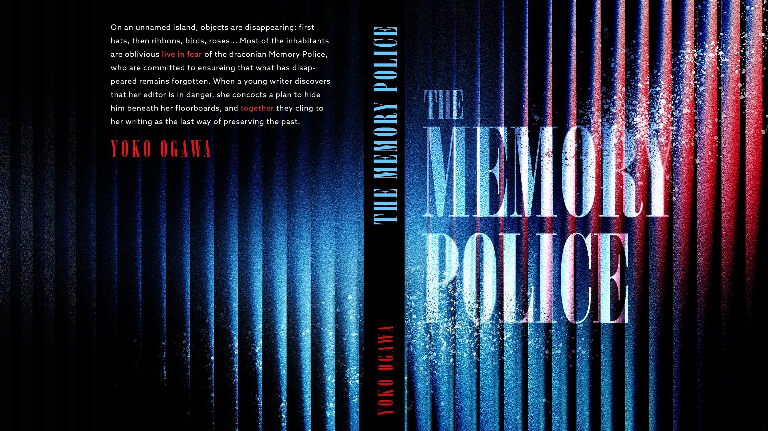
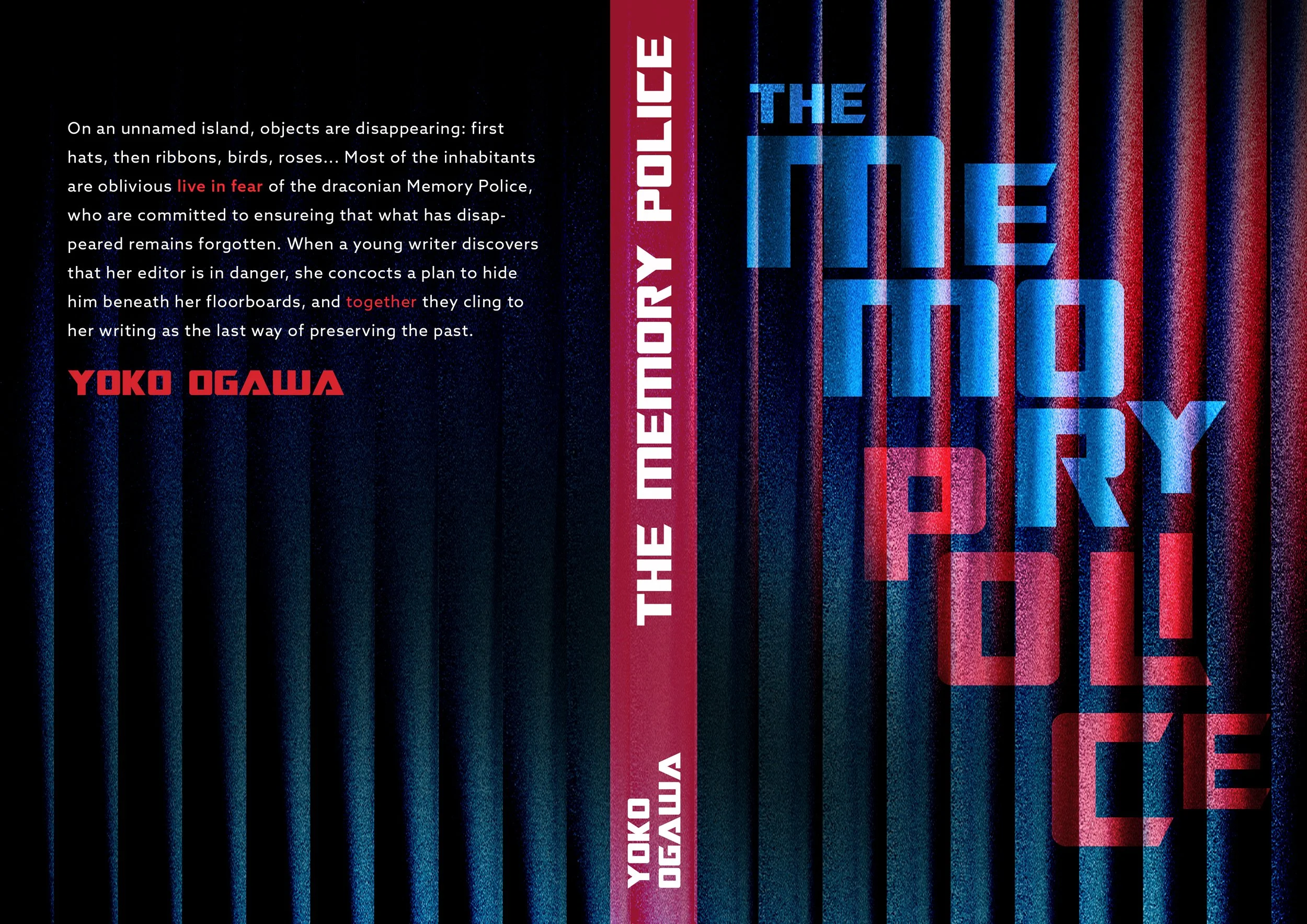
SYNOPSIS
PUBLICATION DESIGN
The design for The Memory Police must address the narrative defined by absence, erasure, and quiet psychological control. The challenge lies in translating the novel’s intangible experience of gradual loss into a compelling visual language. Rather than relying on generic minimalism, the design should embody a sense of progressive disappearance, evoking unease, fragility, and remaining visually striking.
“The Memory Police” by Yoko Ogawa is a dystopian novel set on an unnamed island where objects and the memories associated with them mysteriously disappear. The island's inhabitants passively accept these losses, but a secretive force called the Memory Police ensures that any remaining traces, or those who remember, are erased.
The protagonist, a young novelist, realizes that her editor, R, retains his memories despite the disappearances. To protect him from the Memory Police, she hides him in a secret room in her house. As more things vanish, society becomes emptier. The protagonist struggles to hold onto her identity through storytelling, even as the world around her fades.
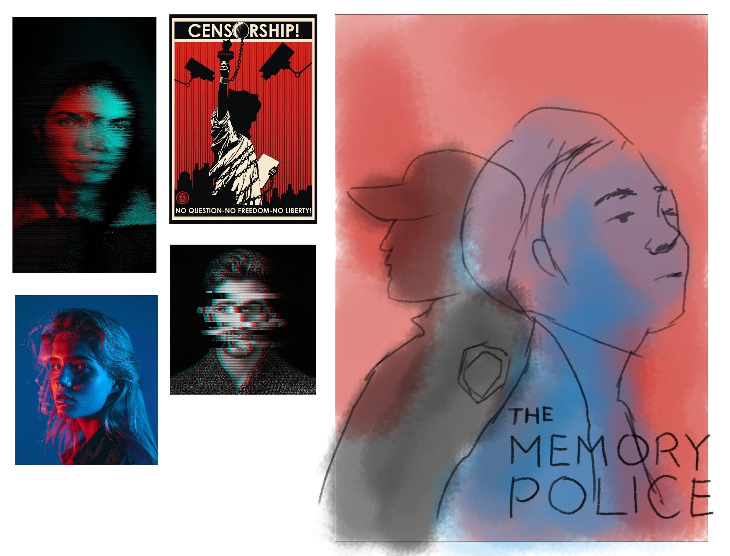
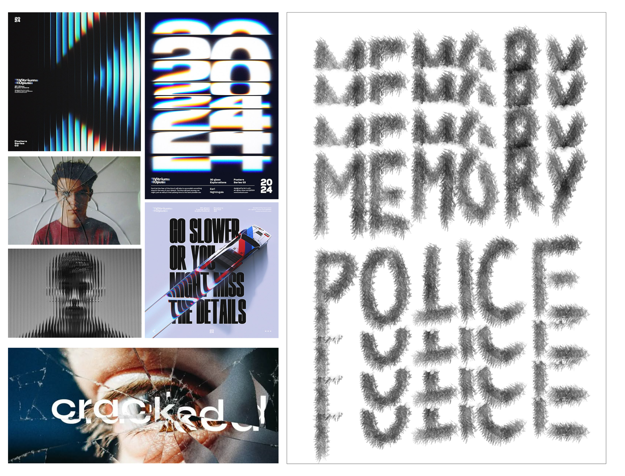
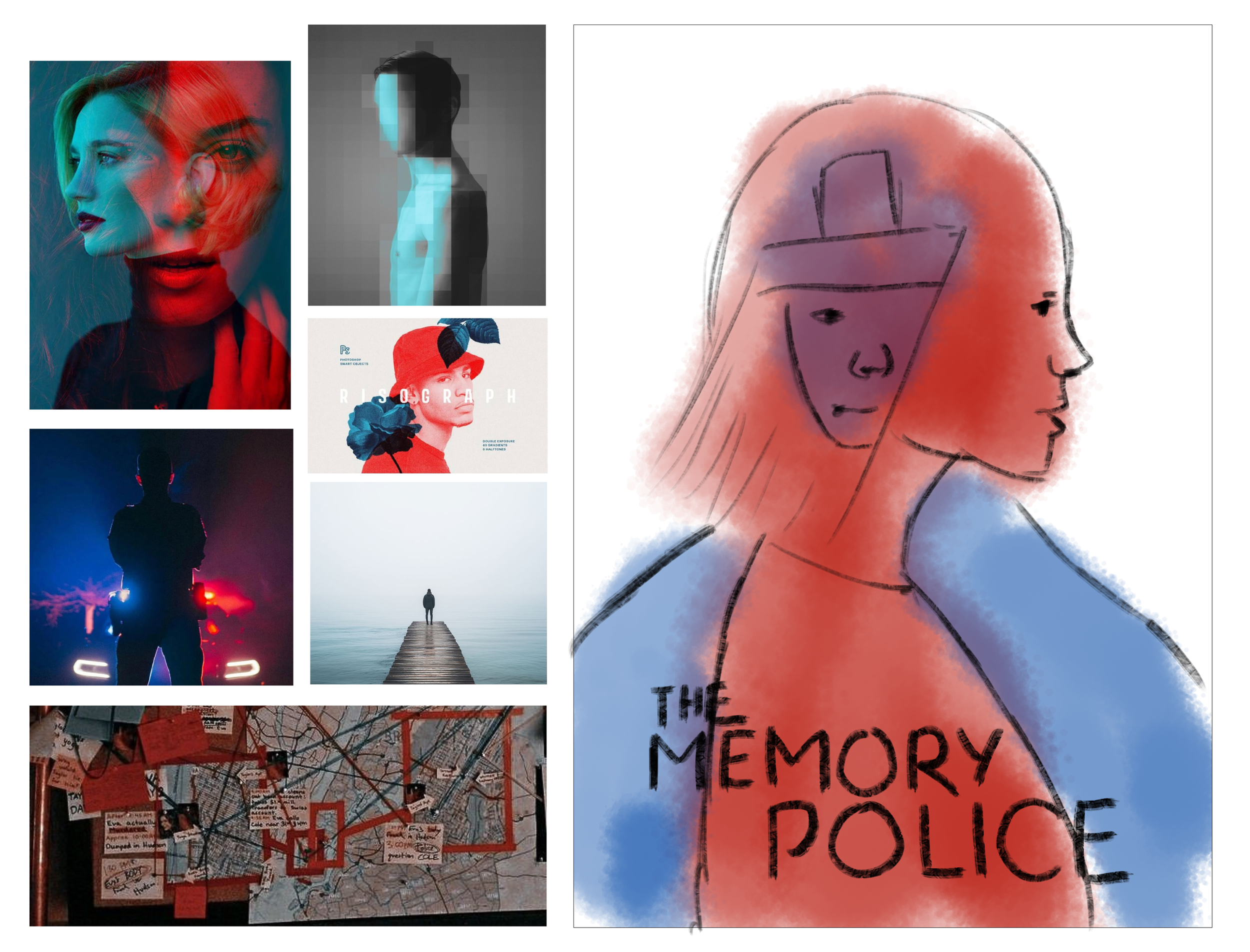
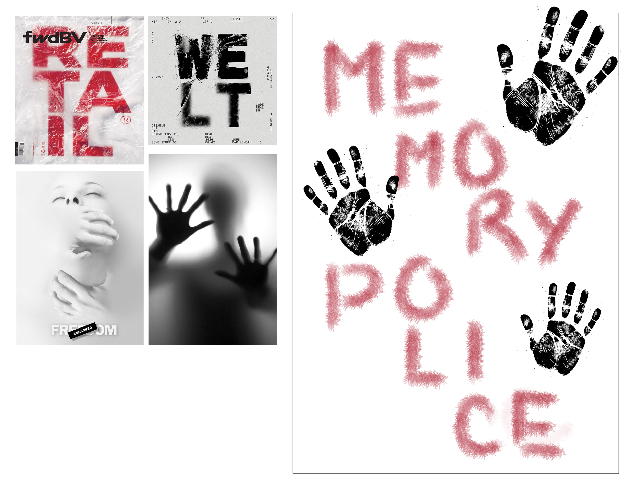
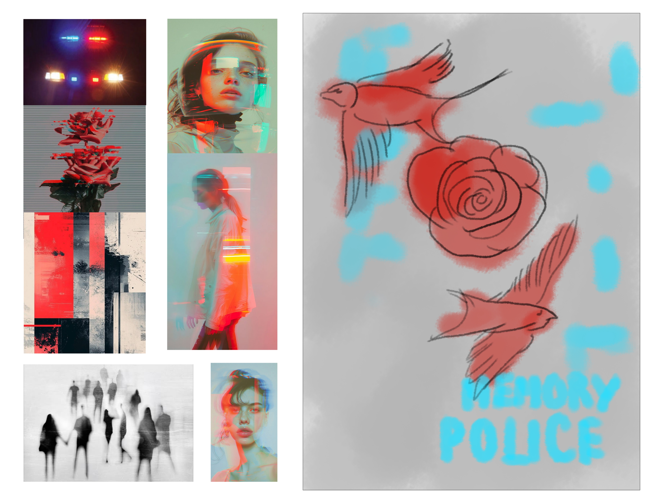
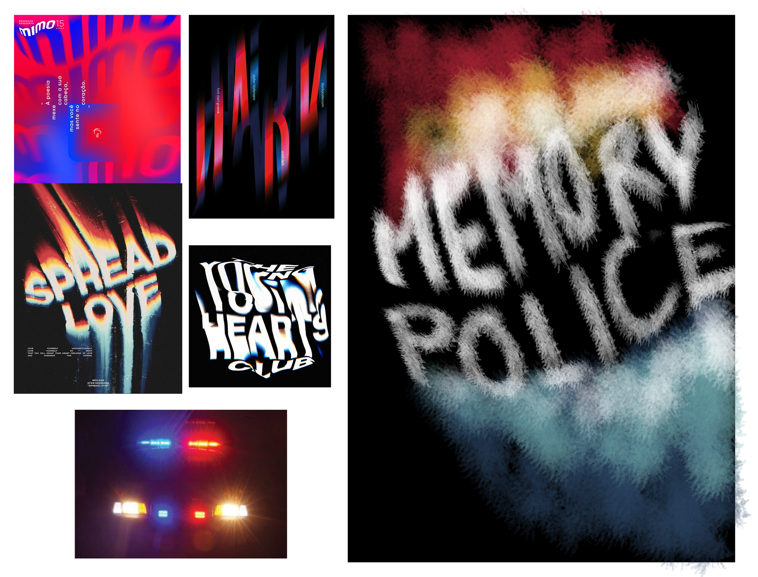
INSPIRATION AND SKETCHES
CONCEPTS
FINAL
CONCEPT
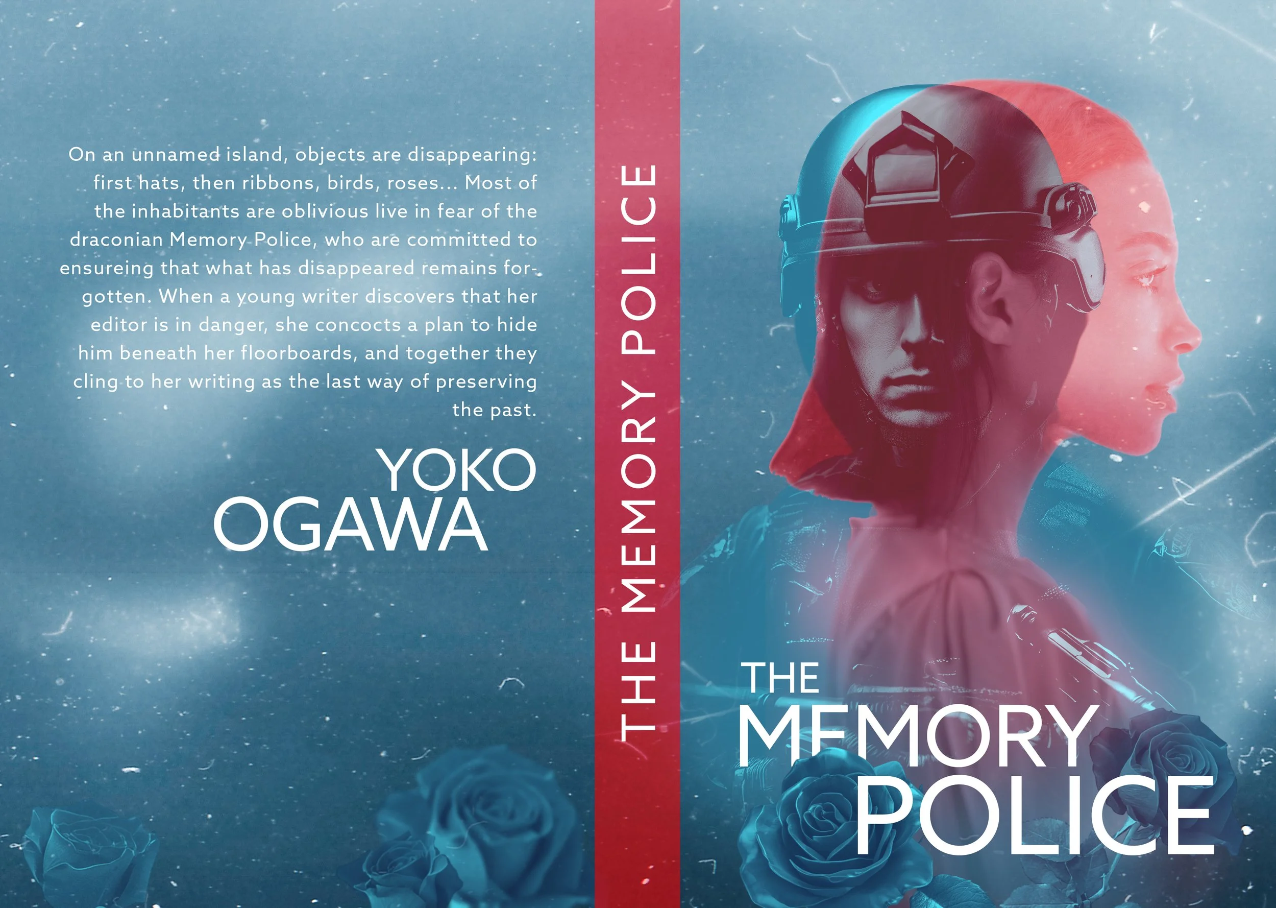
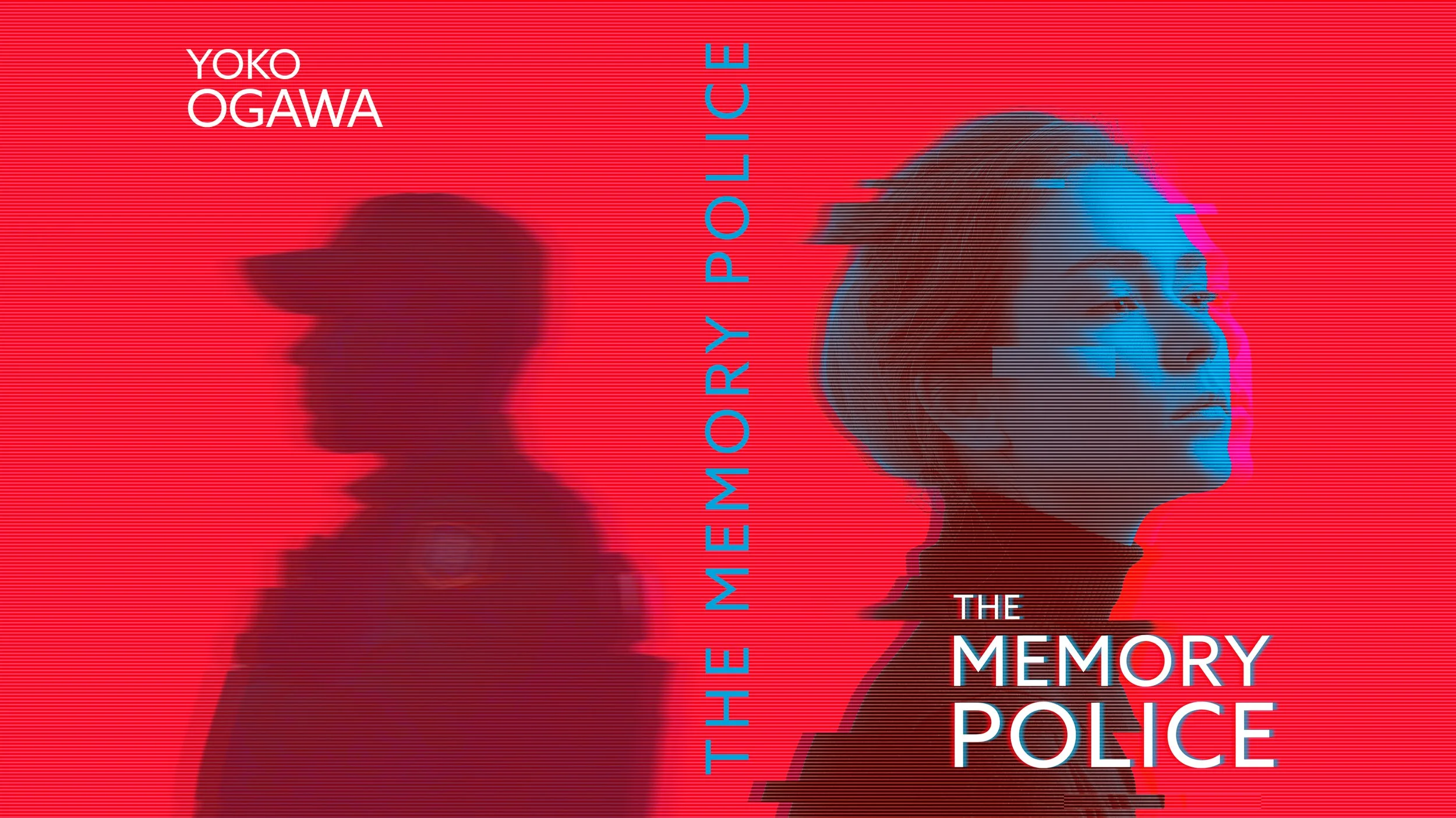
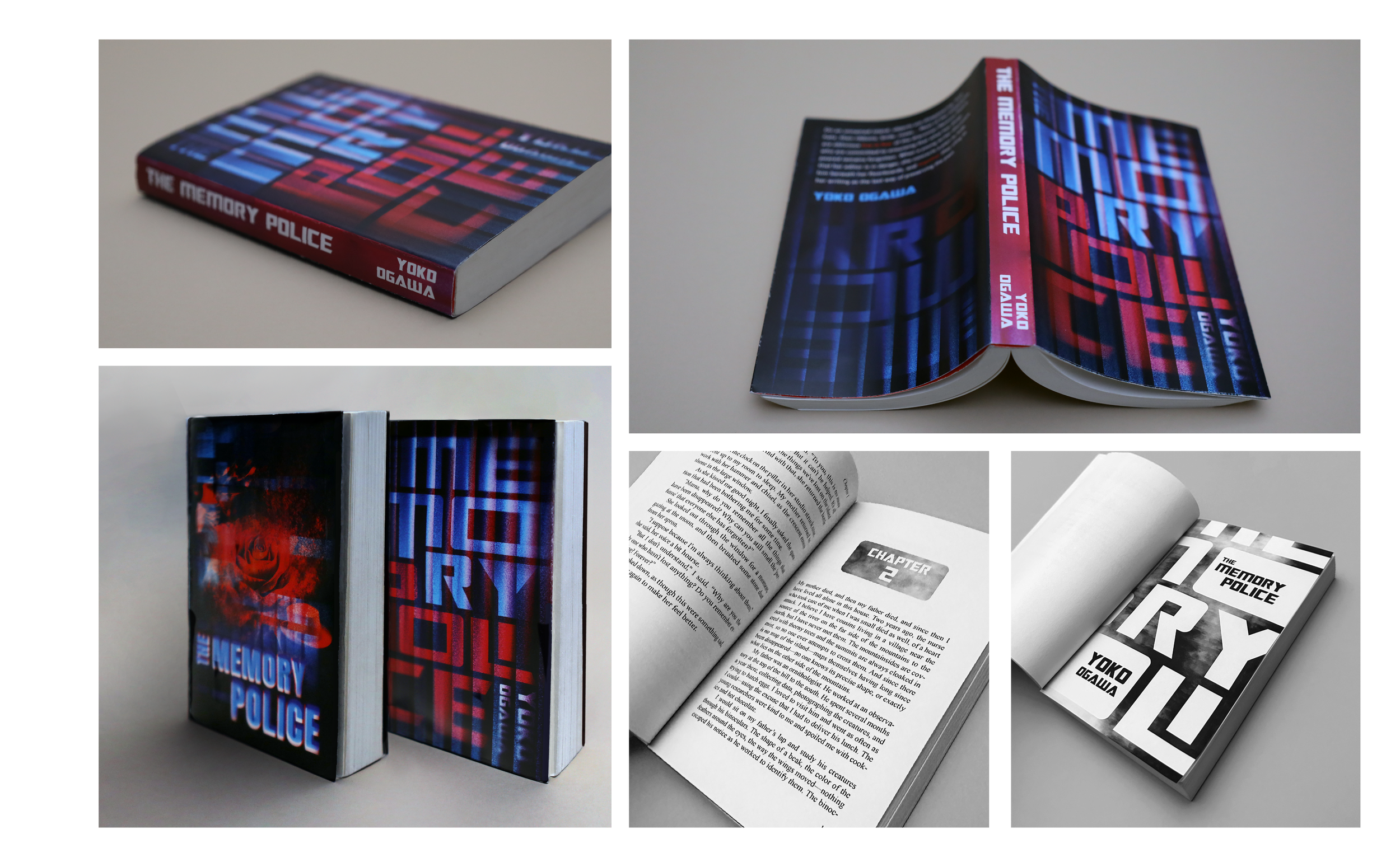
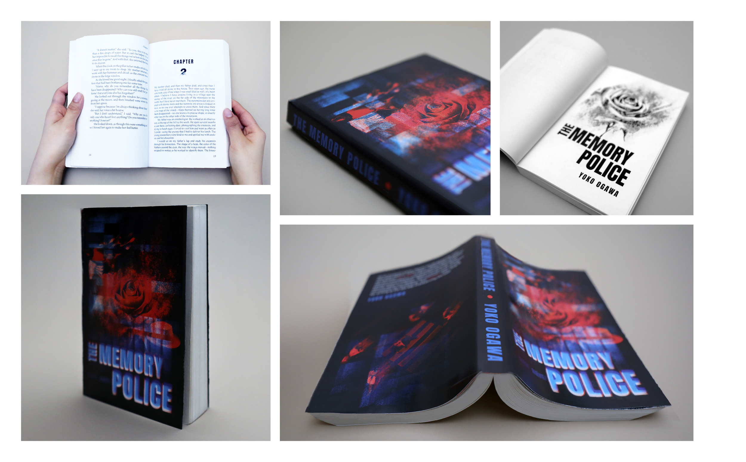
Two versions were developed to represent the theme of the book. Both versions utilize the red-and-blue color palette, a symbolic sign from police sirens.
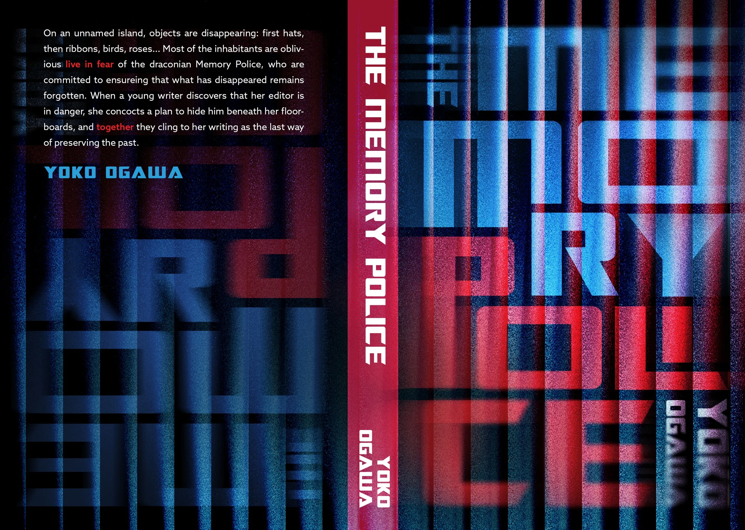
The first solution is type-dominant composition. It transforms typography into the concept itself. By manipulating the letterforms into a geometric layout, the composition builds a visual “maze” that feels repetitive and inescapable—echoing how the inhabitants are trapped within an invisible system enforced by the Memory Police. The use of glassmorphism effects with transparent, blurred layers and refracted edges creates a sense of distortion and illusion. Additionally, the integration of type across front, spine, and back establishes continuity, suggesting the book's theme is about controlled systems
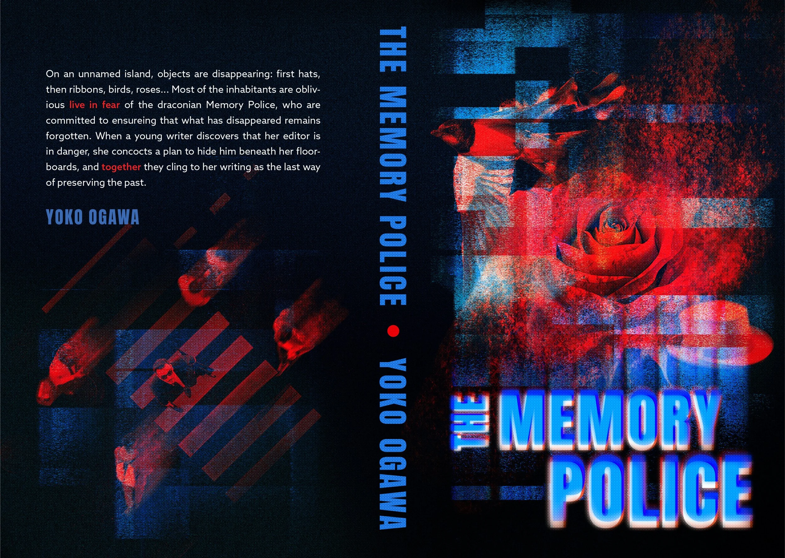
The second solution is image-dominant composition. The inclusion of key objects in the book such as roses and birds from the book represents disappearance as they dissolve into dust along with glitch textures and visual noise. The layer of abstract blue shapes in the front cover evokes police siren lights, reinforcing authority without directly depicting the Memory Police. The top-down perspective in the back cover suggests surveillance and the unsettling idea that people are being watched by unseen force they cannot understand.