
PROJECT
OVERVIEW
EXPERIENTIAL DESIGN
As remote collaboration, global entrepreneurship, and exchange programs continued to rise, a lot of individuals develop a mobile lifestyle that exists between destinations. There is a gap between productivity and recovery. From those realities, Velora Herky was established. It is a multi-use innovation and lifestyle campus located near Sacramento International Airport. The campus primarily accommodates wealthy business professionals, entrepreneurs, consultants, exchange students, and relocating residents who frequently traveled across cities and countries. Velora Herky functions as an ecosystem that provide an all-in-one experience, eliminating the need for off-site driving between daily activities.

TARGET AUDIENCE
Traveling entrepreneurs/collaborators managing their work across cities

Exchange students adapting to a new cultural and academic environment

Relocating professionals and transitional residents
brand
identity
Velora Herky embraces minimal architectural language that prioritizes geometrical forms, elevated walkways, glass partitions, and diffused natural light. These help reduce fatigue and allow users to recover from the travelling stress. Materials such as lightwood, stone, marble, and transparent surfaces. This allows the environment to feel structured and balanced. The color palette consists of dusty sky blue, beige, and creamy white. This creates a soft atmosphere that feels modern and timeless. At the same time, it still reinforces the concept of elevation. The mood and tone should communicate the same subtle elevation. This art direction aligns with its core values of luxury, minimalism, and elevation.
The final logo captures the campus’s identity. The symbol, formed by combining the initioals V & H, is not immediately literal, but instead built from intersecting geometric lines. The sharp, upward angles of the form subtly suggest elevation and ascension, reinforcing the core concept of a space the lift users above the chaos of travel. At the same time, the open structure of the mark creates a sense of lightness. aligning with the architectural language of the campus. The typography complements the symbol by reinforcing clarity. The sans-serif letter forms reflect a minimalistic and highly legible design language.


awareness
campaign
To introduce Velora Herky to its target audience, an awareness campaign was implemented around Sacramento International Airport. Every day, thousands of travelers pass through the airport while keeping up their tight schedules, waiting for flights, or transitioning between destinations. The airport represents the most strategic location to reach this audience.
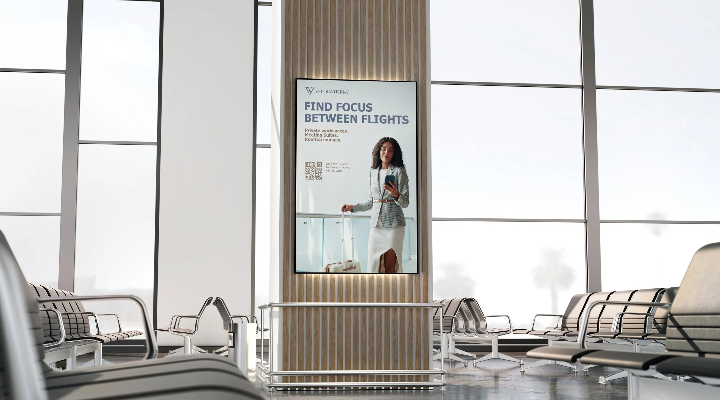
The campaign began with placing posters within airport lounges and high-traffic waiting areas. These posters presented Velora Herky as an elevated alternative to typical travel environments. The design focused on minimal and luxurious visual style, strong imagery and concise messaging that communicates the campus experience quickly. Each poster included a QR code that allowed people to access the booking website or learn more about the campus amenities. By providing an easy digital entry point, the campaign encouraged engagement from travelers who need workspace or relaxation between flights.
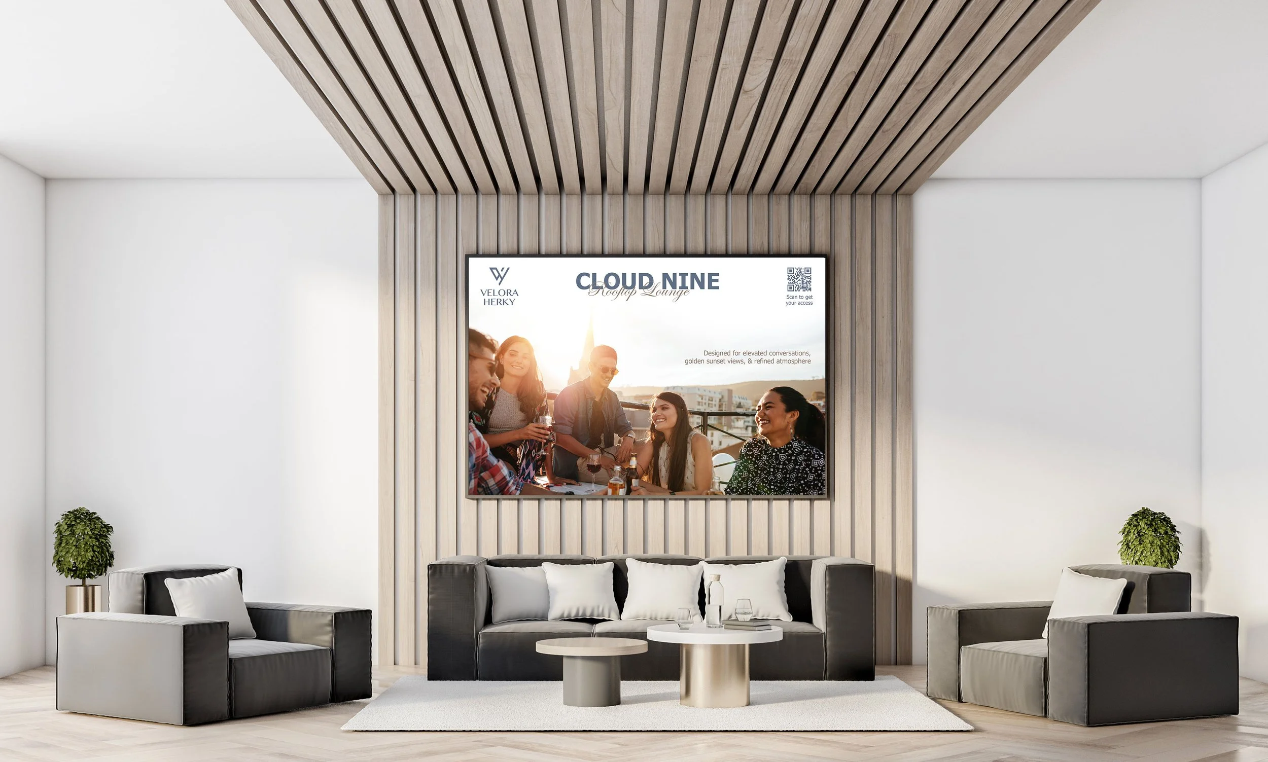
Additionally, digital displays and video content were shown in VIP and premium airport lounges. These screens introduced different amenities within Velora Herky through short visual narratives. An example on the next page highlighted the Cloud Nine rooftop lounge during sunset. By rotating content across multiple displays, the campaign can present the campus as a diverse ecosystem rather than a single facility.
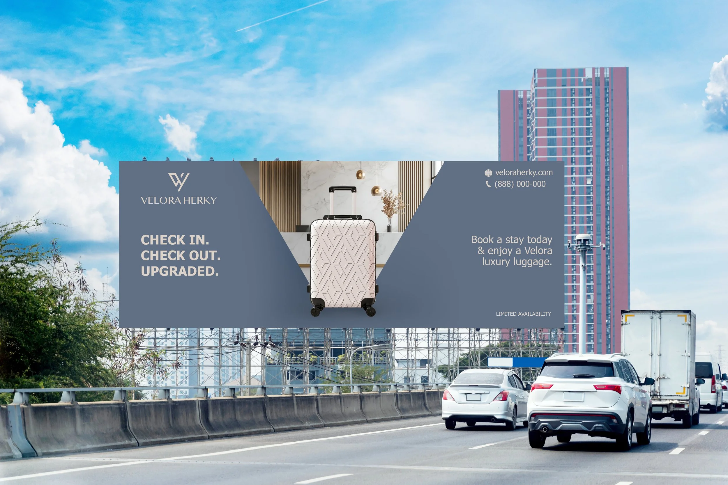
Beyond the airport interior, large promotional billboards were placed along the primary freeway routes leading to the airport, targeting travelers arriving by car or rideshare. These billboards show promotion “Book a stay today and enjoy a Velora luxury luggage” to encourage immediate action. The provided luggage carries Velora Herky branding identity. This promotion functions as both an incentive and a branding tool.
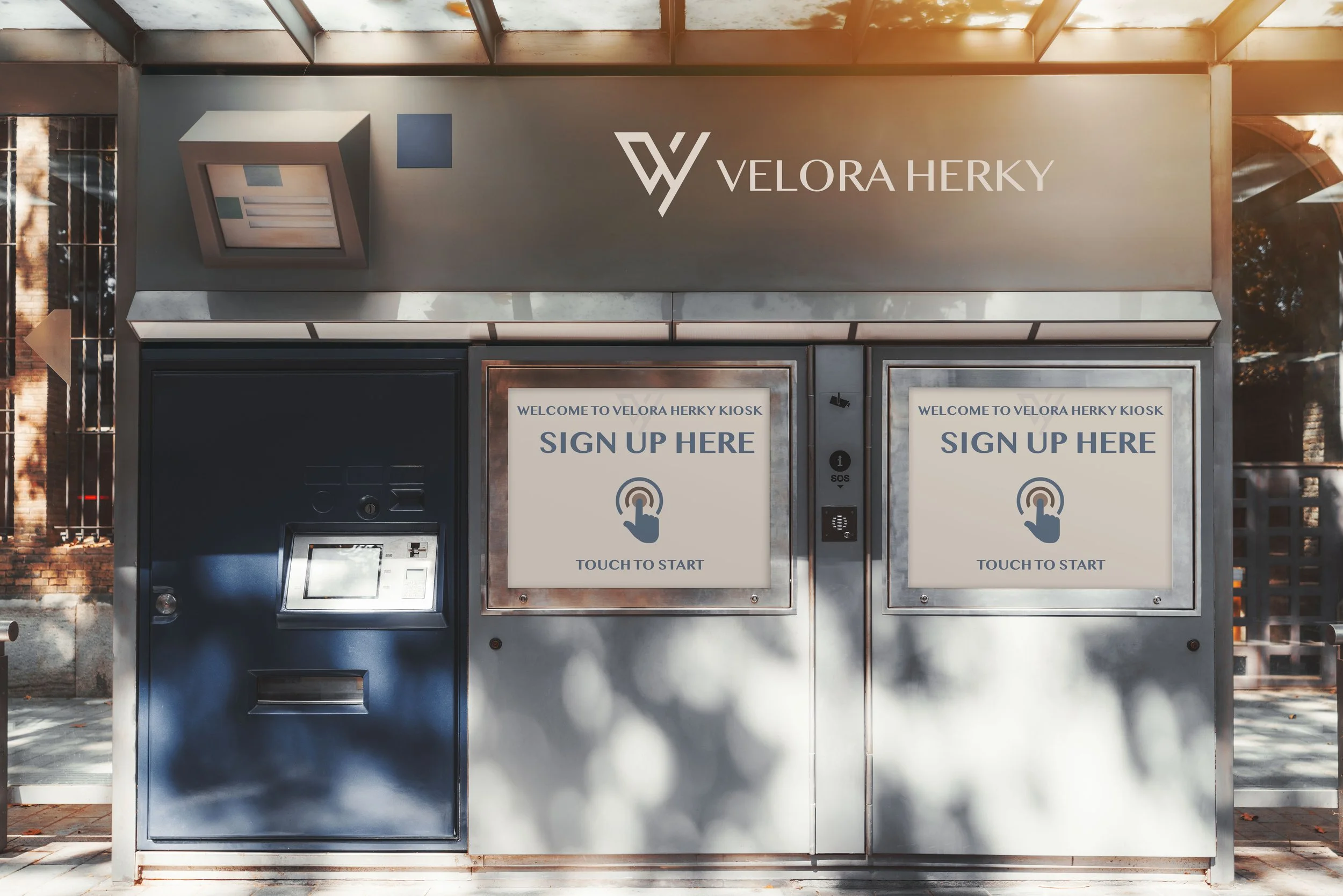
Self-service sign-up kiosks were also installed within certain areas of the airport. These kiosks allow people to explore the campus amenities, view available workspaces or resident suites, and sign up for day passes or longer. Additionally, the kiosk included an option for users to book a transit cab after signing up. The interface provided directions to a designated pick-up point within Sacramento Internation Airport. The transit service will take them directly to Velora Herky’s Welcome Center, creating a seamless and smooth transition from digital interaction to physical arrival.
Together, these strategies form a cohesive awareness campaign. The combination of physical posters, digital displays, billboards,and interactive kiosks to make sure that Velora Herky remains visible across different touchpoints.
experience
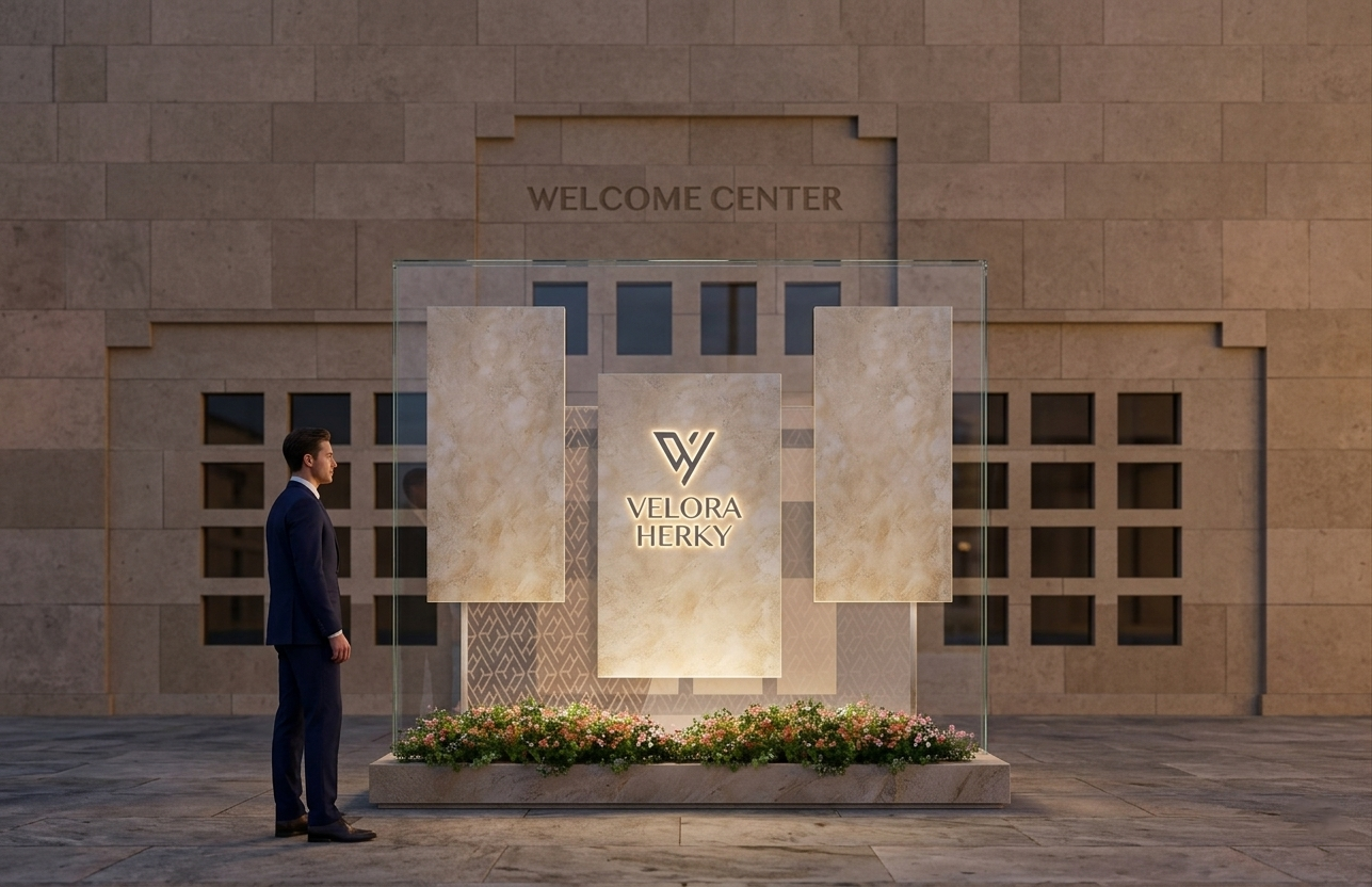
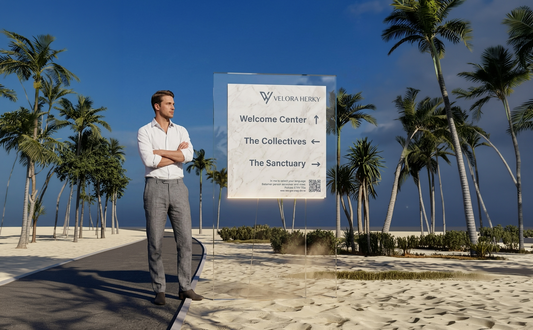
From the moment users enter the campus, every interaction is guided by a visual system that feels calm and intuitive. Velora Herky adopts the idea of geometric rectangular forms in signage and wayfinding. These shapes reflect the broader language of the campus. Signages were constructed using marble surfaces adhered to transparent glass, creating a layered effect that gives the impression of floating, which reinforces the conceptual idea of levitation. Marble conveys luxury, while glass introduces airiness. As light passes through these materials, the signage appears to float. This subtle visual effect transforms functional elements into experiential elements.
Positioned at the Welcome Center, where visitors are first dropped off by the transit cab, there is a signature signage landmark. The signage consists of die-cut steel lettering embedded into a solid marble surface. Supporting the structure is a layer of transparent glass, which visually lifts the signage off the ground and creates the impression that it is levitating. This combination reinforces the brand’s commitment to material quality and minimalistic design. At night, LED backlighting placed behind the letterforms of the signage illuminates the campus name. This creates a subtle glow and still maintains the calm atmosphere of the campus.
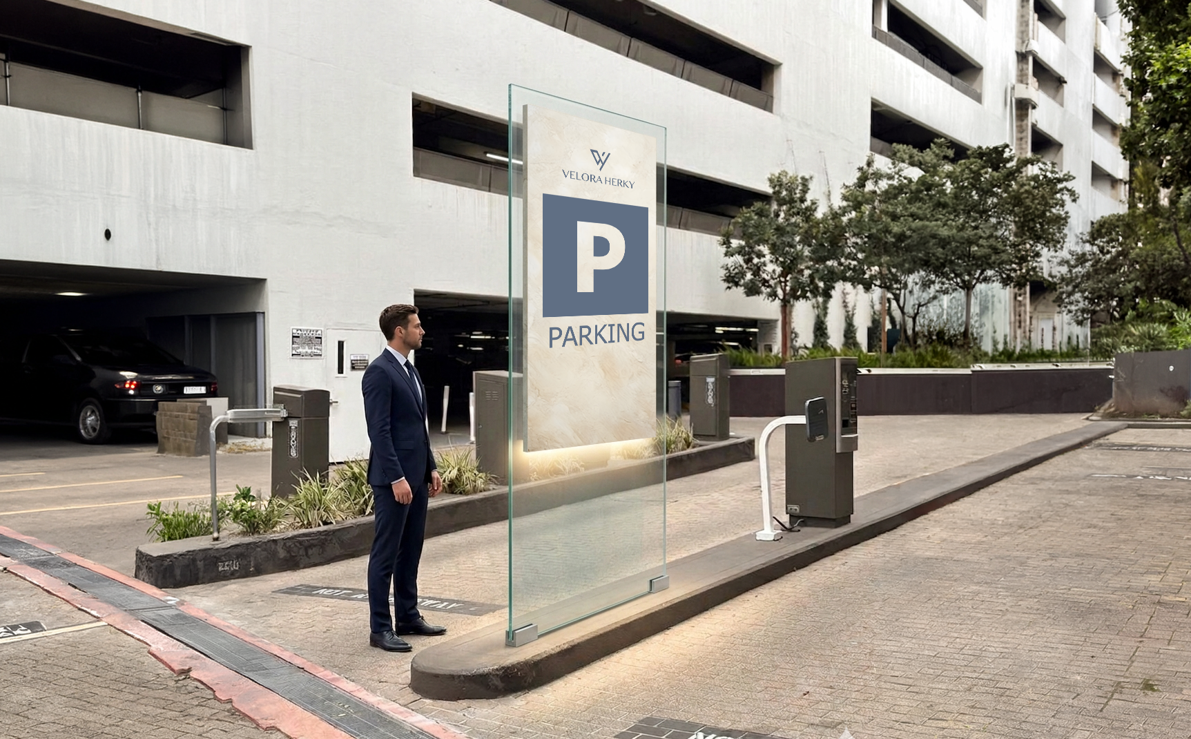
The directional signage, identification signage, and informational signage throughout the Velora Herky campus continues the same design philosophy established at the Welcome Center, ensuring a cohesive experience. Each sign adopts the same rectangular marble surface supported by a layer of transparent glass as its primary form. Text is kept minimal, using san-serif typeface. This approach makes the signage system easy to recognize and follow.
follow up
campaign
The follow-up strategy focuses on extending the user experience beyond physical space through merchandise. Rather than typical souvenirs, these items are intended to become part of the user’s everyday life, especially within the context of travel. This approach strengthens brand recognition and allows users to organically promote the campus as they move between destinations.
The baseball cap is available in dusty sky blue and creamy beige, reflecting the brand’s core color palette. The hand-stitched logo on the front adds a level of craftsmanship, reinforcing the idea of quiet luxury. This becomes a casual yet effective form of brand visibility. The leather passport holder directly aligns with the lifestyle of Velora’s target audience. As an essential item for frequent travelers, it provides both functionality and symbolic value. The debossed logo on the front cover keeps the brand recognition, while the interior layout has a passport pocket, a sleeve for note paper, and a luxury pen with the logo color imprinted on it. This package reflects Velora Herky attention to detail and commitment to refined experiences. And the luxury suitcase represents the most impactful piece within the merchandise system. It incorporates a texture pattern created from the Velora Herky logo, embedding the brand identity directly into the material rather than leaving a flat surface. This creates a consistent visual language with the campus’s minimalistic aesthetic
These merchandise items are effective because they balance functionality and brand visibility. Each product serves a different level of engagement. By embedding the brand into objects that users already rely on, Velora Herky ensures that its presence extends beyond the campus.